Made for your brand. Built for your space.
3D Built-Up
Letters.Dimensional sign letters for shopfronts, receptions & buildings
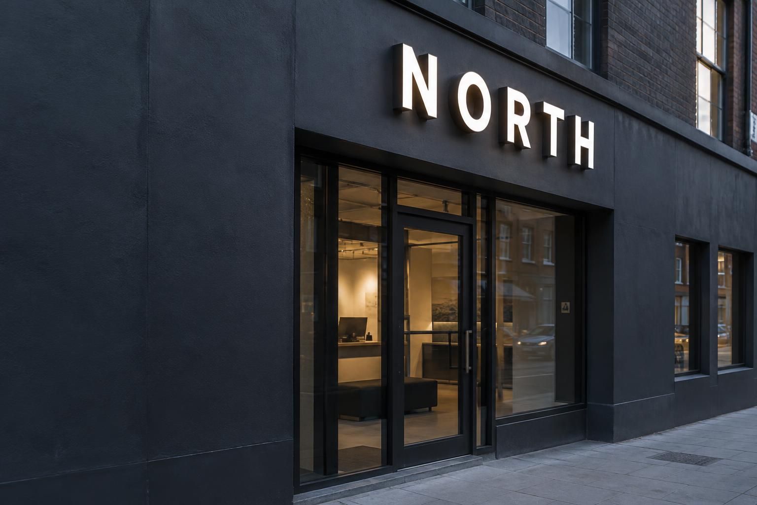
Turn your identity into something you can feel. Beautiful depth, considered finishes and light that makes your name impossible to overlook.
Let’s create your statement signDiscover the possibilities0208 150 3330Real dimensional presence
Faces, returns and shadow
A finish that feels right
Metal, acrylic and colour
Light, your way
Unlit, face, halo or combined
Considered installation
Designed around the site
Not just a name on a wall
Built-up letters that give
your brand another dimension.
A great sign changes how a place feels. On a façade it creates confidence. Behind reception it sets the tone. In a shopfront it turns a passing glance into recognition.
We shape the face, depth, finish and mounting around your identity — so the sign belongs to the building, rather than simply being attached to it.
From a compact reception logo to a larger building identity, the proportions are developed around your artwork and viewing distance.
Three ways to make an impression
Choose your 3D sign letter style.
Quietly sculptural or brilliantly illuminated. The same logo can tell a very different story.
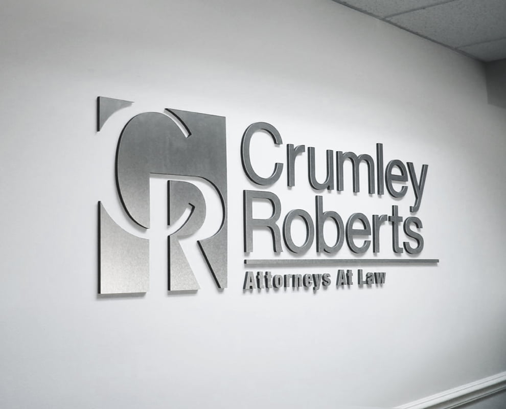
Reception walls · Architectural entrances
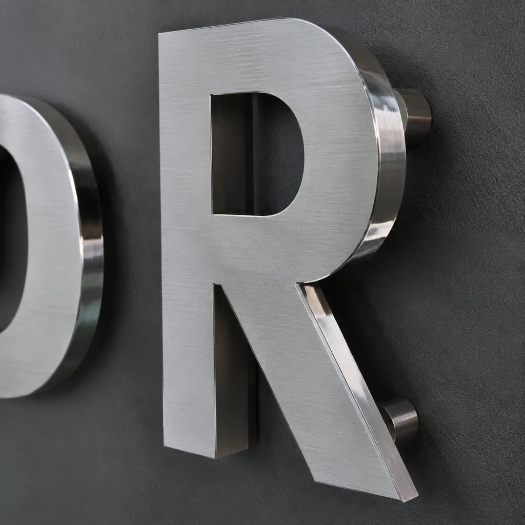
Sculpted metal
Let the material do the talking. Fabricated stainless steel, aluminium or brass creates a strong silhouette, with brushed, polished, painted or sample-led patinated finishes.
- Opaque faces with considered return depth
- Non-illuminated, or paired with rear illumination
- A strong choice for entrances and reception walls
The difference is in the detail
Stainless, aluminium & acrylic letters — beautiful from every angle.
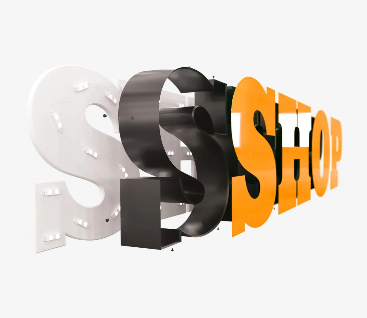
01 / Form
Depth from every angle
Angled SHOP lettering reveals the relationship between faces and returns. The visible white, dark and orange finishes demonstrate how a sign changes with viewpoint.
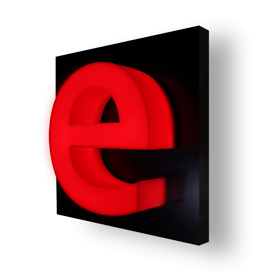
02 / Colour
Colour with presence
A red dimensional letter shows the impact of a single strong colour. Agree physical colour samples and the intended daytime and night-time appearance.
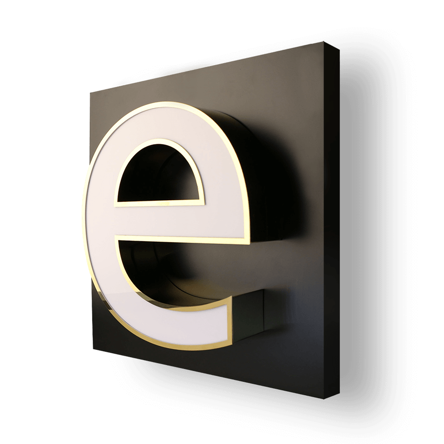
03 / Depth
Clean dimensional profiles
A pale face and contrasting return show how depth changes a letter’s silhouette. Profile, return finish and visible edges deserve the same attention as the logo.
Where, when & why
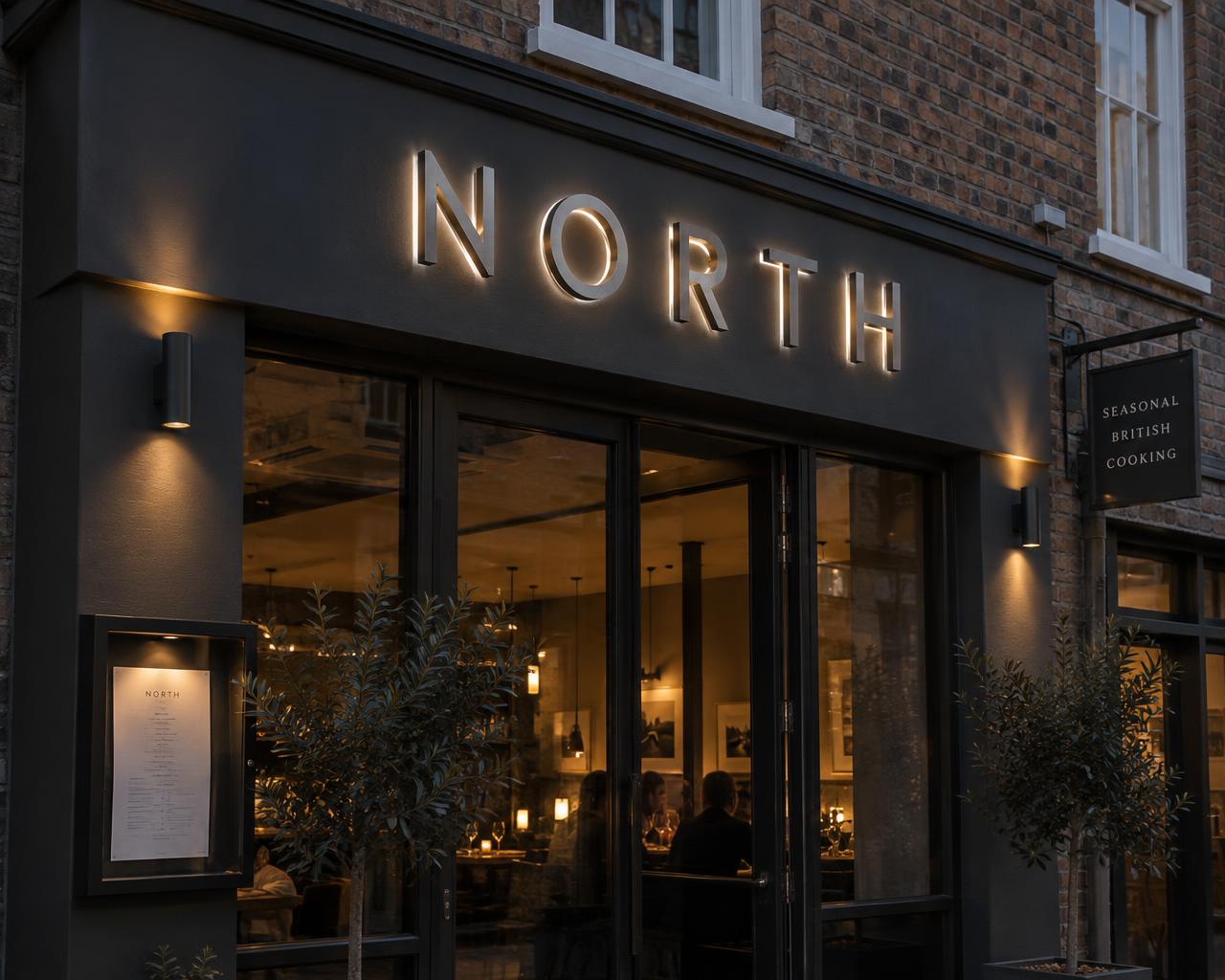
Where to use 3D built-up letters.
Built-up letters suit any place where your name should feel permanent and premium — read from the street, recognised in a lobby, photographed in a showroom. They work best on solid, flat surfaces with a clear viewing line, and are ideal when a printed panel would feel too flat for the brand.
Scroll sideways for all six settings. Less suitable: uneven or fragile surfaces without a backing panel, very short-term use, or spots with no clear sightline — we'll advise an alternative if so.
Ask where yours would work bestBeautiful outside. Considered inside.
The details behind
the statement.
The right glow and a considered mounting make your lettering feel part of the architecture. Explore the possibilities before we shape the specification around your site.
Set the mood, day and night
See how the glow, white tone and position of the LEDs change the character of your entrance.
Plan what sits behind the finish
Understand mounting, cable routes and servicing access before settling on the final look.
Questions about planning, permissions or mains electrics?
Read our site approvals & planning guide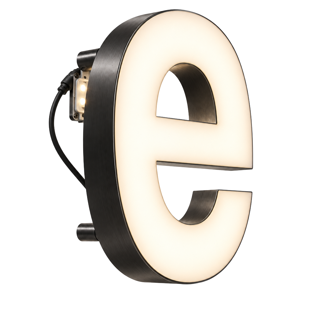
01 / Illumination studio
Find your signature glow
Face-lit, halo-lit or both. Compare lights on and off and explore warm-to-cool white LED tones.
Explore illumination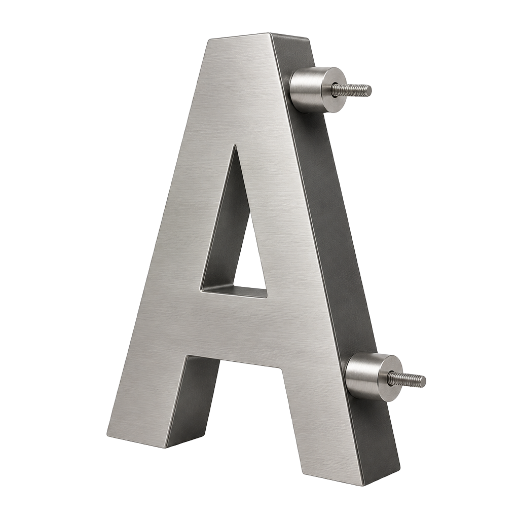
02 / Fixings & mounting
Beautifully held in place
From discreet studs to supporting frames. Explore mounting methods and what works for your sign and site.
Explore fixing methodsBefore we bring it to life
Built-up lettering FAQs.
01Built-up or flat-cut: what is the difference?
Built-up letters have a face and fabricated returns that create a hollow three-dimensional form. Flat-cut letters are cut from solid sheet and can be mounted on locators for a shadow gap. We recommend the construction around the size, depth and appearance you want.
02Can you make our exact logo?
Send vector artwork and brand guidelines. Fine strokes, small characters and sharp corners can affect fabrication and illumination. We flag any changes and agree the drawings before production.
03Can the letters be used outdoors?
Yes, with an exterior specification agreed for the site. Exposure, material and finish, drainage, fixing surface and any electrical enclosures must be assessed together; an indoor example is not evidence of outdoor suitability.
04Which lighting colour should I choose?
Warm white tends to feel softer; neutral or cool white can give a crisper appearance. Kelvin is colour appearance, not brightness. The full technical guide lets you compare lighting types and white tones; the final choice is confirmed against a physical sample.
05Who provides power and installation?
Installation and low-voltage sign connections are scoped in your quote. Building mains supply, isolation and associated electrical work are the client’s qualified electrician’s responsibility unless explicitly agreed otherwise. Drivers need safe, accessible locations.
06What determines price and lead time?
Letter size, quantity, depth, finish, illumination, artwork and installation access affect the quote. Design approval, materials and site readiness affect the programme. Tell us your target date; urgent availability is confirmed by the studio.
Your identity. Made tangible.
Get a quote for your
built-up letters.
Tell us where it will live, the look you love and when you need it. We’ll help shape the materials, depth, lighting and installation into a clear, tailored proposal.
0208 150 3330- 01Share your brand, setting and starting idea
- 02Review the construction and finish together
- 03Agree the quote, drawings and project programme
Have drawings or brand guidelines ready? Send them with your detailed brief.